Case Study · Jun 2024 – Aug 2025
VHS:
Modernizing
& Unifying
Operations for
Mental Healthcare
A revolutionary IoT platform that unifies task management,
patient monitoring, and EHR data to enhance staff
efficiency and elevate patient safety.
Lead UX/UI Designer
2023 – 2025
Figma · FigJam · Miro
HIPAA Compliant
🔒 vhs.com
🔒 vhs.com
Scroll


Project Overview
My Role
Lead UX/UI Designer (with Product Management responsibilities)
Timeline
Jun 2024 – Aug 2025
Tool
Adobe XD, Figma, FigJam, Miro, Google Forms
Standards
HIPAA Compliant Design
Key Responsibilities
Led project planning, defined the product roadmap, and managed timelines,
taking on key product management duties to ensure efficient milestone
achievement.
Directed the end-to-end design process, from foundational user research
and strategy to final UI implementation.
Established and maintained a scalable design system in Figma that
enhanced product consistency and accelerated development cycles.
Facilitated alignment between design, engineering, and key stakeholders to
ensure a shared product vision and streamlined execution.

The Problem
The hospital's existing system was inefficient and
paper-based, causing daily friction and stress for both
patients and clinicians, and posing risks to patient
safety.
Our Design Hypothesis
We hypothesized that by designing a single,
integrated platform combining daily operational tools
with advanced, real-time IoT patient monitoring, we
could empower clinical staff with a unified, proactive
workflow — simultaneously enhancing efficiency
while elevating the standard of patient safety and
care.

Research Findings
Key Insights & Design Opportunities
Key Finding (The Pain Point)
Design Opportunity (The "So What?")
1. Fragmented & Inefficient Documentation
The heavy reliance on paper documentation made task handovers and
collaboration extremely slow and prone to error.
To build a streamlined digital Task Management Tool that simplifies and
automates high-frequency tasks, ensuring accountability and optimizing care
coordination.
2. High-Risk Manual Room Checks
Manually logging room checks was not only time-consuming but also posed a
high risk of inaccuracies and missed critical duties.
To develop a Revolutionary Health Monitoring Solution that provides non-
invasive, around-the-clock monitoring and visualizes health trends for
proactive care.
3. Lack of Continuous Vital Monitoring
Vital signs were logged on paper, making it impossible to provide the
continuous, 24/7 surveillance needed for high-risk patients.
To create a comprehensive Bed Board Manager and leadership dashboard that
offers a real-time overview of bed availability, patient assignments, and staff
allocation.
4. Inaccessible Operational Insights
Hospital management lacked a real-time, comprehensive view of operations,
relying on slow, manual check-ins with individual staff.
To design a Centralized Key Operation Hub with seamless EHR Integration,
creating a "Single Source of Truth" that eliminates paper and saves significant
time.
5. Increased Risk During Night Shifts
Staff reported that efficiency dropped significantly at night, increasing the risk
of patient emergencies and slowing response times.
To leverage Radar Integration for a discreet active monitoring system that
provides Real-Time Alerts, enabling swift intervention and improving patient
safety during off-peak hours.


Defining Users & Key Workflows
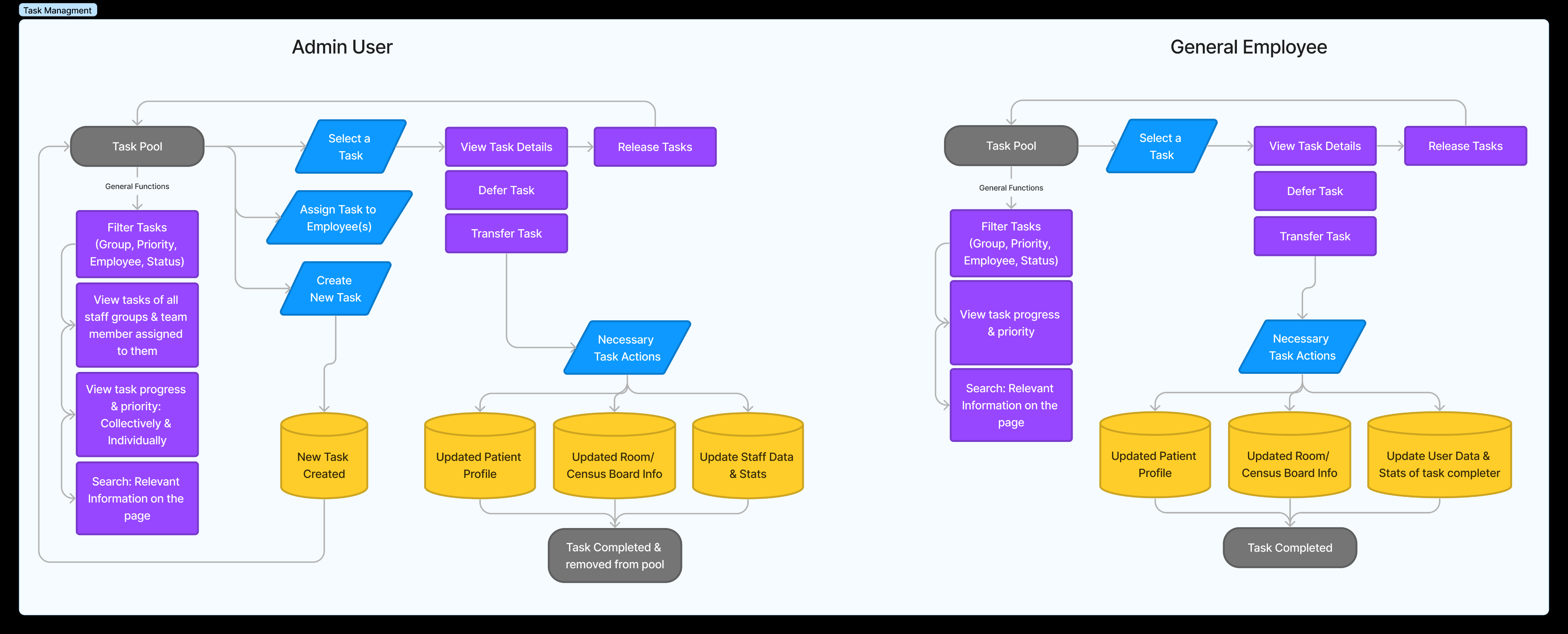
Our research revealed two primary user groups with distinct needs and permissions:
Admin Users and General Employees.
To ensure the platform was both powerful and secure, I began by mapping out their key
workflows, particularly for high-frequency tasks like 'Task Management'. This process
was crucial for defining the role-based access controls and ensuring the user
experience was tailored to each group's specific responsibilities, all while maintaining
HIPAA compliance for patient data.
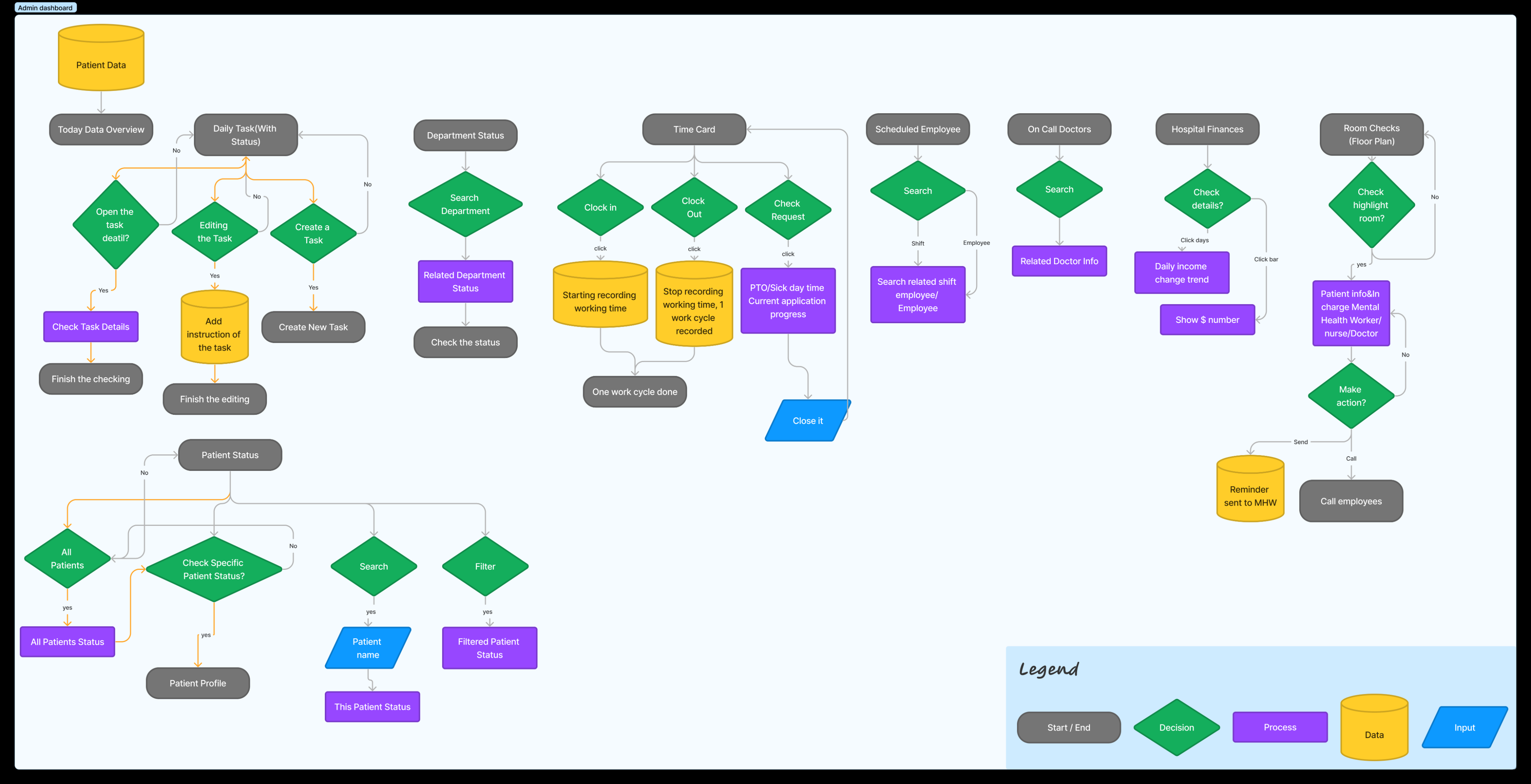
With the core user flows defined, the next challenge was to structure the entire
platform into a coherent and scalable system. I developed a comprehensive
Information Architecture diagram to map out all key sections of the admin dashboard.
This blueprint served as the biggest source of truth for the entire team, ensuring a
logical foundation for the interactive dashboard and facilitating quick access to critical
data.

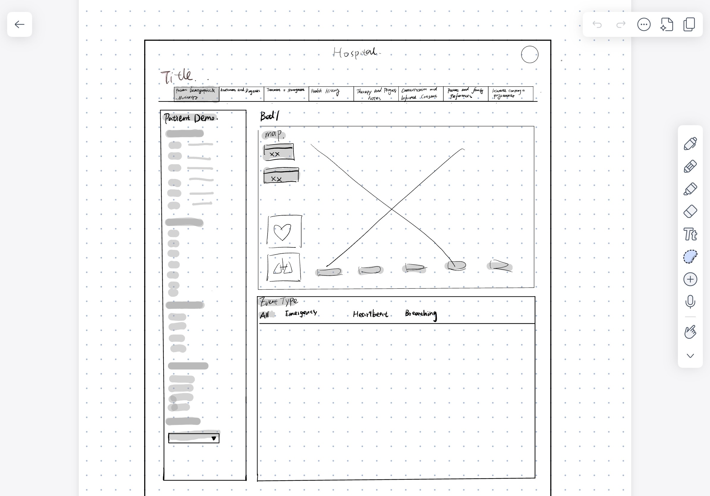
Early Ideation: Low-Fidelity Wireframes
Our research revealed two primary user groups with distinct needs and
permissions. I began by mapping out their key workflows for high-frequency
tasks, crucial for defining role-based access controls while maintaining
HIPAA
compliance
.
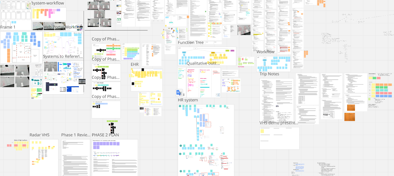
The Command Center: Our
Collaborative Hub
"Throughout the project's one-year lifecycle, a central digital whiteboard in Miro served
as our team's 'virtual command center.' This space housed everything from our initial
research synthesis and brainstorming sessions to the system's function tree and multi-
phase planning."
It was an essential tool for maintaining clarity and alignment across the team,
especially given the project's complexity. This single source of truth was vital to
our collaborative and iterative process.
Challenge & Solution
The Challenge of Remote Collaboration
Challenge:
Our team was fully remote, while the hospital we were designing for was in a
different state. This created significant challenges for immersive research
and seamless communication.
My Solution:
I established a hybrid communication model to maximize clarity and empathy. This involved structuring our process around regular remote workshops (using Miro and FigJam for interactive sessions) and planned, intensive on-site visits during critical research and testing phases.
The Challenge of Ambiguous User Requirements
Challenge:
Clinical staff, while experts in their field, often found it difficult to articulate
their specific software needs and abstract requirements.
My Solution:
My Solution:
To bridge this communication gap, I implemented two key facilitation techniques:
- Internal Role-Playing Workshops: My team and I would role-play user scenarios to transform vague requests into concrete, testable user stories, which we then validated with the users.
- Visual Mood Boards: I created and shared mood boards with users to provide them with a concrete visual language to better describe their aesthetic preferences and desired "look and feel."
The Challenge of Design-Developer Alignment
Challenge:
In the early stages, discrepancies between our design proposals and the
development team's technical constraints led to rework and delays.
My Solution:
I tackled this proactively with a two-pronged approach:
I initiated and led the creation of a comprehensive Design System in Figma, which became the single source of truth for all UI components and patterns.
I modified our workflow to include mandatory technical feasibility checkpoints with the engineering lead immediately after the user flow stage, ensuring our designs were practical and buildable before moving to high-fidelity UI.
The Challenge of a Dynamic Project Environment
Challenge:
A tight one-year timeline, remote communication, and a busy client made a
traditional "waterfall" process unworkable.
My Solution:
Recognizing this, I championed and helped facilitate the team's transition to an Agile development methodology. This allowed us to deliver value incrementally through MVPs (Minimum Viable Products), gather client feedback in smaller, manageable loops, and iterate effectively. This shift was critical to navigating uncertainty and successfully delivering the entire system.
Final Outcome
The final solution is a modern, unified platform that directly addresses the core problems of
operational inefficiency and fragmented communication — providing a centralized, intuitive interface
that significantly reduces administrative friction and enhances patient care quality.
01
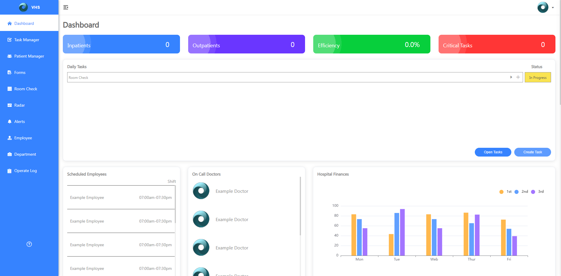
Showcase 1: The Centralized Command Center
The main dashboard serves as the staff's 'single source of truth'.
My key design decision was a modular, card-based layout that
presents complex, high-volume information in digestible chunks.
The information hierarchy surfaces the most critical tasks and
alerts first, allowing staff to assess the hospital's status at a glance.
🔒 vhs.com
🔒 vhs.com
02
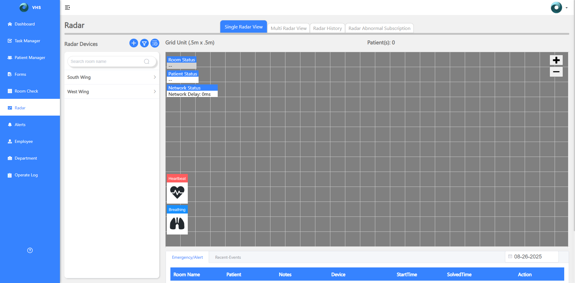
Showcase 2: Real-Time Proactive Monitoring
The radar monitoring page translates complex, continuous IoT
data into an instantly understandable interface. Color-coded
alerts and clear status indicators ensure staff can identify and
respond to critical incidents in seconds — shifting from a reactive
to a proactive model of care.
The VHS Design System
To ensure consistency and scalability, I established a comprehensive design system including a well-
defined color palette, typographic scale, and custom icon set — becoming the single source of truth for
both design and development.
Color Palette — [Primary Blue 500]
Intent
Trust, clarity, action — primary emphasis in a medical context.
Primary Uses
Primary buttons (Submit / Save / CTA)
Selected/active states (tabs, pagination, chips)
Interactive text links & info-level highlights
Chart Series #1
Blue Scale
Typography & Icons
Typeface Rationale
Clinically readable at small sizes; clear I/l/1, O/0
Windows-native; matches hospital workstations
No webfont download; faster on weak networks
Accessible with WCAG tokens; stable under OS scaling
≈ Typeface: Segoe UI
Segoe UI Bold / 700
Segoe UI SemiBold / 600
Segoe UI Regular / 400
Segoe UI Light / 300
Icon Set

Project Impact & Results
This project successfully transitioned from a design concept into a fully implemented solution,
delivering significant value to the client.
Successful Launch & Deployment
The VHS platform is now live at the client hospital. The core infrastructure, including the advanced radar monitoring
equipment, has been fully deployed on-site — marking a major milestone in the hospital's technological modernization.
Positive Client Adoption & Feedback
The system is currently being rolled out to all clinical staff, with active training sessions underway. The initial response
from hospital leadership and early adopters has been overwhelmingly positive.
"The feedback from hospital administration has been extremely positive, describing the new platform as a 'game-changer' for their daily operations and
expressing great satisfaction with its potential to enhance patient care."
Delivering on Core Value Propositions
This successful launch validates our initial design hypothesis. The platform is now actively helping the facility centralize
key operations and enhance patient safety — directly fulfilling the core goals set at the start of this year-long
engagement.
Reflection & Future Vision
What I Learned
This year-long project was a profound learning experience in designing for a complex, high-stakes environment. A key takeaway
was the importance of establishing a shared language with both clinical users and engineers early on. Techniques like role-
playing and a robust Design System are not just 'nice-to-haves' — they are essential for translating ambiguous needs into a
beloved product under strict HIPAA standards.
What I Would Do Differently
If I were to tackle this project again, I would advocate for involving the engineering lead even earlier — in the user research
phase. This would have allowed us to identify technical constraints sooner and align on feasibility more efficiently, saving
valuable time during development sprints.
Next Steps
My work on the foundational platform has paved the way for several exciting future expansions:
1.
Integration with Financial Systems (Billing & Insurance): Expand from clinical operations into the administrative workflow by
developing an integrated payment and billing system, further solidifying VHS as the single source of truth for all hospital
operations.
2.
Exploring Telehealth Capabilities: Incorporate telehealth functionalities — remote consultations, digital prescriptions, and
online patient follow-ups — to evolve VHS from an operational tool into a comprehensive patient care ecosystem.
Takeaway
"Designing for healthcare means designing for trust.
Every decision — from information hierarchy to
alert colours — carries real consequence for staff
and patients alike."
24
mo
End-to-end timeline
5
+
Core modules designed
Live
✓
Deployed at client hospital
HIPAA
✓
Compliance maintained
Back to Projects
© 2026 — Hannah zhang
[
H·Z
]
Projects
About Me
Say hello 👋