Case Study · UX / UI Design
YiCare Nursing Platform
— Brand & UI System from Scratch
An end-to-end platform for senior-care providers in Tier-1 Chinese cities, delivered
across a PC admin console and a WeChat Mini Program. Supports workflows from
order/service management to health monitoring and risk notifications.
Role:
Sole UI Designer
Platforms:
PC Admin + WeChat Mini Program
Users:
Admin · Caregivers · Seniors · Families
Scope:
Brand + UI + Design System + QA
Status:
Phase 1 dev complete · Rollout March 2026
My Role
My Role
I served as the sole UI Designer, working
closely with the PM and engineering team, and
owned the 0→1 visual design.
Scope
End-to-End Ownership (0→1 visual foundation + cross-platform UI delivery)
01
Brand & Visual Definition
Brand
Led logo design, color tokens, and typography standards.
02
Visual Exploration
Research
Ran competitive audits and built moodboards to define
two visual modes: core application UI and large-screen
data dashboard.
03
UI Design
Multi-platform
Produced high-fidelity UI for core workflows across the
PC admin console (management + dashboards) and the
WeChat Mini Program.
04
Design System & Handoff
Systems
Built and maintained a component library with states,
guidelines, and reusable patterns to ensure consistency
and scalable delivery.
05
Design QA
Quality
Partnered with engineering through implementation,
validating key states and layouts to achieve pixel-
accurate results.
Design Goals & Challenges
Design Goals
& Challenges
What the design
needed to achieve —
and what stood in the way.
Goal 01
Build Trust
Establish a professional,
calm, and reliable visual
identity aligned with
healthcare and senior-care
services.
01
Goal 02
Optimize readability and
interaction for older adults
with clear hierarchy, low
cognitive load, and
accessible patterns.
02
Ensure Senior-
friendly Usability
Goal 03
Create a scalable visual
language — from logo to
components — across the
PC admin console and the
WeChat Mini Program.
03
Achieve Cross-
platform
Consistency
Constraints
4 design pressures
C · 01
0→1 with Limited Inputs
The project started from wireframes only, with no existing
brand assets or UI standards; I had to define the logo,
color/tokens, typography, and component system from
scratch.
C · 02
Platform Compliance & Native UX
The Mini Program needed to comply with WeChat design
guidelines and interaction constraints to deliver a native
experience.
C · 03
Localization Expectations (China)
Users often expect a stronger "tech + premium" visual
signal than Western minimalist patterns; the design had
to balance perceived professionalism with usability.
C · 04
Density and Accessibility Tension
B-end workflows required high information density and
speed, while C-end experiences demanded larger type,
higher contrast, and reduced distractions — delivered
under one shared brand DNA.
These constraints shaped a 'Warm Tech with Trust' direction and two visual modes for different contexts.
Strategy · Market · Opportunity · Visual Direction
Strategy
Market + Opportunity
+ Visual Direction
Understanding the landscape before picking a direction — trust
(healthcare), efficiency (B-end operations), and care (C-end
seniors/families) from day one.
01
Why Visual Direction Comes Before UI
Most projects inherit a brand. This one didn't — I was handed wireframes and a product brief,
with no logo, no color, no visual precedent. That meant the visual direction wasn't decoration;
it was the product's first impression. Getting it wrong would mean rebuilding trust with every
screen. Getting it right meant the UI could carry the brand consistently from day one —
across staff dashboards, mobile toolboxes, and a senior-facing mini program.
02
Market Scan: What I Learned
From comparing senior-care/healthcare products across the US and China, I found:
US Products
US products tend to be minimalist and utilitarian —
clear but often visually restrained.
Residents
248
Active
231
Alerts
7
OK
⚠
OK
OK
9:41
●●●
Good morning,
Margaret
Today's vitals
72
bpm
98%
O₂
118
BP
›
›
›
★
某某市养老信息管理系统 v2.1
admin | 退出
×
▶ 首
页
老人档
案
护理记
录
费用管
理
系统设
置
您的位置:首页 > 老人档案管理 > 列表查询
【查询条件】
姓名:
性别:
请选择 ▼
状态:
请选择 ▼
查 询
重 置
新 增
导 出
序
号
姓名
性别
年龄
联系电话
操作
1
张大明
男
78
138****5566
查看
编辑
2
李淑芬
女
82
139****7788
查看
编辑
3
王建国
男
75
135****2233
查看
编辑
共 248 条记录,第 1/25 页
首页
上一页
1
2
下一页
智慧养老大数据可视化平台
2024-12-01 14:32:08
在院老人
248
▲ 3.2% 较上月
护理完成率
96.8%
▲ 1.4% 较上月
今日预警
7
▼ 2 较昨日
月度入住趋势


服务类型分布


248

入住

上门

日托
⚠ 实时预警
301室 · 张大明 心率异常
高危
205室 · 李淑芬 血压偏高
关注
China Market
China market expectations often favor a stronger
"tech + premium" signal; overly minimal UI can be
perceived as less professional.
03
Opportunity: A Clear Gap in China's Senior-care UX
Local competitors often fall into two extremes:
The Opportunity Gap: a product that balances modern technology with human warmth - without sacrificing usability.
Traditional medical UI
Conservative and dated
Trusted but low in perceived efficiency — feels
like legacy government software.
★ 养老管理系统
欢迎,管理员
▶ 档案管理
护理记录
费用管理
位置:首页 › 老人档案 › 查询
查询条件
姓名:
床位:
查询
重置
新增
序号
姓名
年龄
状态
操作
1
张大明
78
在院
查看|编辑
2
李淑芬
82
在院
查看|编辑
3
王建国
75
请假
查看|编辑
共248条 第1/25页
上页
1
下页
★ 老人信息录入
基本信息
* 姓名:
* 性别:
请选择 ▼
* 出生日期:
身份证号:
家庭住址:
健康信息
护理等级:
请选择 ▼
入住类型:
请选择 ▼
保 存
取 消
Pure "tech" UI
Modern and data-heavy
Powerful but cold and complex, which
increases friction for older adults.
智慧养老监控中心
LIVE · 14:32
在院
248
完成率
96%
预警
7
设备
32
入住趋势 · 近12月


服务分布


入住

上门

日托
⚠ 实时预警
301室 · 心率异常
高危
205室 · 血压偏高
关注
设备 · 健康监控
实时生命体征
心率
72 bpm
血压
118/76
血氧
98%
体温
36.8°C
在线设备
腕式心率仪 × 12
在线
床位感应器 × 8
在线
血压计 × 3
弱信号
04
Design Strategy: Warm Tech with Trust
I defined a visual direction that combines:
Professional, modern structure (layout,
hierarchy, data visualization) to build
credibility.
Human-centered details (readability,
reduced distractions, rounded shapes, softer
accents) to support senior-friendly usability.
Visual Direction
"Warm Tech with Trust"
Yicare智慧养老
关怀 · 信任
🔵
专业 · 现代 · 值得信赖
🤍
以人为本 · 减少干扰 · 易于使用
下载健康报告
→
With the direction defined, I translated it into two context-specific visual modes for B-end and C-end
experiences.
Visual Execution
Visual
Execution
Context-specific UI
under One Brand DNA
With the Warm Tech with Trust direction defined, I translated it into
experiences for two distinct user groups: B-end (admins/caregivers) and
C-end (seniors/families) — while keeping one consistent brand DNA
across platforms.
5.1 B-end
B-end Experience:
Efficiency, Professionalism, Consistency
Module A
Unified Brand Entry
across PC + Mobile
·
Decision:
Designed a consistent brand entry using a unified illustration and visual languageacross platforms.
·
Rationale:
Staff should feel instantly oriented and "in work mode" whether they log in from desktop or mobile.
·
Proof:
Cross-platform entry patterns reduced visual fragmentation and improved immediate recognition (validated in stakeholder reviews).


智能养老系统
登录到

请输入账号/手机号

请输入密码

发送验证码
记住账号
忘记密码 ?
登录


登录


9:41
我已阅读并同意《用户使用协议》《隐私协议》
登录/注册
欢迎使用颐居E护
xxx养老社区


点击微信一键登录
注册

其他方式登录
手机验证码登录
Unified brand entry — same visual DNA across PC and mobile, reinforcing trust and
familiarity from the first screen.
Module B
PC: Daily Operations
vs Professional
Monitoring
·
Decision:
Created two UI modes for distinct contexts:
- Light mode for daily operations and data entry
- Dark mode for immersive monitoring and large-screen display
- These scenarios have different demands — long-session work requires
·
Rationale:
These scenarios have different demands — long-session work requires comfort, and clarity; monitoring requires high contrast and rapid scanning.
·
Proof:
The dual-mode approach enabled clearer task-fit and reduced cognitive overload in each context (reinforced by client/PM feedback).
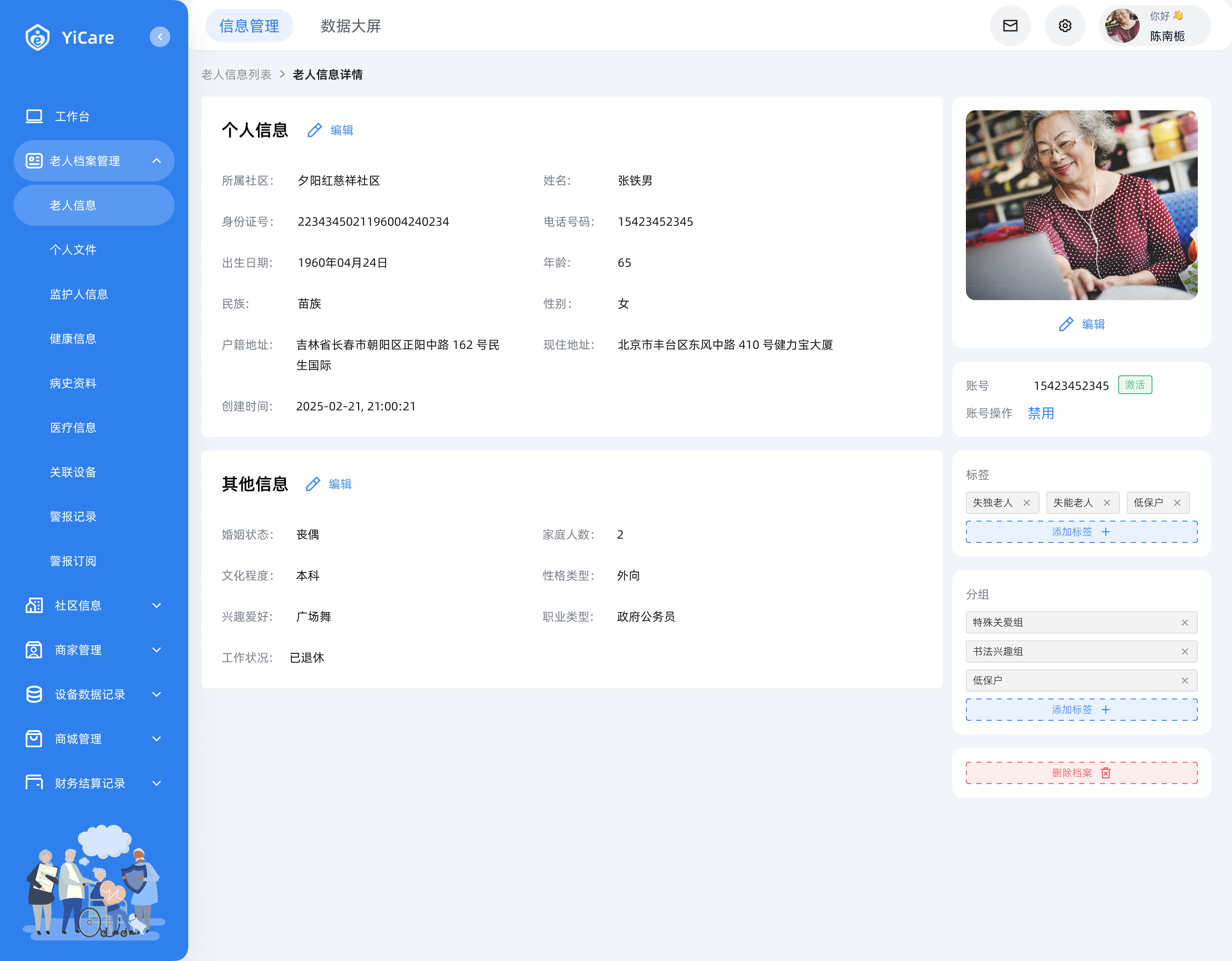
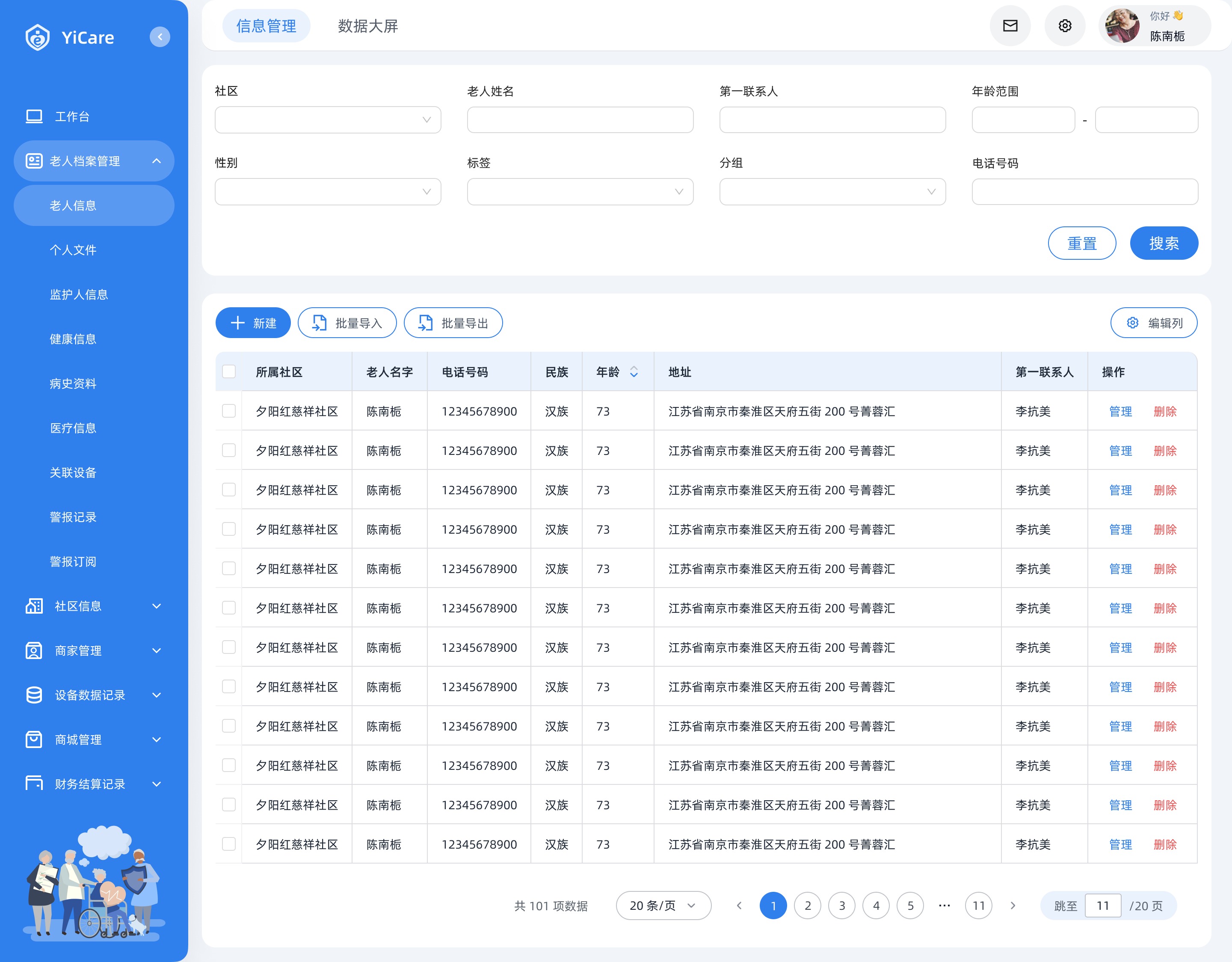
信息管理
数据大屏


你好 👋
陈南栀

Yicare


工作台

老人档案管理


社区信息


商家管理


设备数据记录

商城管理

财务结算记录

账号管理

审批记录

操作记录

社区

老人姓名
第一联系人
年龄范围
-
性别

标签

分组

电话号码
重置
搜索

新建

批量导入
批量导出

编辑列
所属社区
老人名字
电话号码
民族
年龄


地址
第一联系人
操作
夕阳红慈祥社区
陈南栀
15920034817
汉族
73
江苏省南京市秦淮区天府五街 200 号菁蓉汇
李抗美
管理
删除
夕阳红慈祥社区
陈南栀
15920034817
汉族
73
江苏省南京市秦淮区天府五街 200 号菁蓉汇
李抗美
管理
删除
夕阳红慈祥社区
陈南栀
15920034817
汉族
73
江苏省南京市秦淮区天府五街 200 号菁蓉汇
李抗美
管理
删除
夕阳红慈祥社区
陈南栀
15920034817
汉族
73
江苏省南京市秦淮区天府五街 200 号菁蓉汇
李抗美
管理
删除
夕阳红慈祥社区
陈南栀
15920034817
汉族
73
江苏省南京市秦淮区天府五街 200 号菁蓉汇
李抗美
管理
删除
夕阳红慈祥社区
陈南栀
15920034817
汉族
73
江苏省南京市秦淮区天府五街 200 号菁蓉汇
李抗美
管理
删除
夕阳红慈祥社区
陈南栀
15920034817
汉族
73
江苏省南京市秦淮区天府五街 200 号菁蓉汇
李抗美
管理
删除
夕阳红慈祥社区
陈南栀
15920034817
汉族
73
江苏省南京市秦淮区天府五街 200 号菁蓉汇
李抗美
管理
删除
夕阳红慈祥社区
陈南栀
15920034817
汉族
73
江苏省南京市秦淮区天府五街 200 号菁蓉汇
李抗美
管理
删除
夕阳红慈祥社区
陈南栀
15920034817
汉族
73
江苏省南京市秦淮区天府五街 200 号菁蓉汇
李抗美
管理
删除
夕阳红慈祥社区
陈南栀
15920034817
汉族
73
江苏省南京市秦淮区天府五街 200 号菁蓉汇
李抗美
管理
删除
夕阳红慈祥社区
陈南栀
15920034817
汉族
73
江苏省南京市秦淮区天府五街 200 号菁蓉汇
李抗美
管理
删除
共 101 项数据
20 条/页


1
2
3
4
5

11

跳至
11
/20 页
Light mode — 信息管理: daily operations, data entry, long-session comfort.


数据大屏
信息管理


颐居E护


XX社区养老数字化监管平台


老人性别比例


总计
34268人
性别女
11134人
性别男
23134人
老人年龄范围


xx-xx
36%

xx-xx
23%

xx-xx
17%

xx-xx
15%

xx-xx
12%

老人监护人关联
服务订单(月)
在线设备
1234
昨日 5

离线设备
6
昨日 5

警报列表

志愿者任务数量(月)
日交易额/日订单量

类型1

类型2

类型3

类型4

类型5

类型6
警报类型统计


0
40
20
60
80
100
200


类型
时间
姓名
心率过快
13:11:21 09/08/2024
王明明

跌倒警告
13:11:21 09/08/2024
王明明
血压过高
13:11:21 09/08/2024
王明明
血压过高
13:11:21 09/08/2024
王明明
跌倒警告
13:11:21 09/08/2024
王明明
心率过快
13:11:21 09/08/2024
王明明
5
10
15
25
30
20
25/07/2025
100

top1
社区1

188
top2
社区2
138
top3
社区3
120
top4
社区4
88
top5
社区5
36
top6
社区6
14


0
200
400
600
800
1000
数量


81%
新增比例


0
数量/日期

200
400
600
800
1000
数量


老人数量
1234
昨日 3

社区数量
6
昨日 1

商家数量
45
昨日 2


1栋-1单元
人数:40
老人分布:60%
Dark mode — 数据大屏: monitoring and data readability at a glance.
Two modes, one system: light for long-session operations; dark for monitoring and data readability.
Module C
Mobile (Staff):
Task-driven Toolbox
·
Decision:
Designed the mobile home as a task-oriented toolbox with clear cards and priority actions.
·
Rationale:
Mobile usage is often time-sensitive and on-the-go; the UI must optimize speed and reduce steps.
·
Proof:
Clear card hierarchy and action grouping improved scannability and operational efficiency (validated during team reviews).


首页


9:41

老人信息


活动管理

我的排单


评价记录


首页

8
待办

我的


服务中
李勇强
XXX社区
手机号码:134****1234
设备1
强

85%
2
今日待完成
1
已完成
王丽华
王丽华
王丽华
王丽华
王丽华
血压过高
血压过高
跌倒警报
脉搏过快
脉搏过快
2分钟前
2分钟前
2分钟前
2分钟前
2分钟前
已处理
已处理
已处理
已处理
已处理
Task-first mobile IA: key actions surfaced for
quick on-the-go execution.
Task-first mobile IA — key actions surfaced for quick, on-the-go execution.
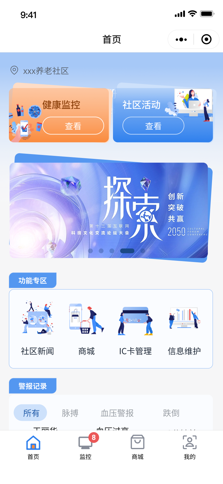
5.2 C-end
C-end Experience:
Trust, Simplicity, Care
Module D
Two C-end Contexts:
"Get things done"
vs "Browse services"
·
Decision:
Designed adaptive UI density depending on user intent:
- Form mode: minimal, high-contrast, distraction-free
- Service browsing: warmer, richer, more reassuring atmosphere
·
Rationale:
Seniors need maximum clarity when completing tasks, while browsing benefits from friendly, confidence-building content presentation.
·
Proof:
This separation balanced accessibility and perceived quality without compromising usability


首页


9:41
注册
请验证手机号


xxx养老社区
健康监控
查看

社区活动
查看

功能专区
社区新闻
商城
IC卡管理
信息维护
警报记录
王丽华
王丽华
张伟
李明
血压过高
血压过高
跌倒警报
脉搏过快
2分钟前
2分钟前
2分钟前
所有
脉搏
血压警报
跌倒

首页

8
监控

商城

我的


验证手机号


9:41
下一步
登录
请验证手机号
标题


填充关键词
辅助提示
验证码
请输入验证码
获取验证码
输入密码


请输入密码
辅助提示
忘记密码?
Adaptive density: minimal for completion;
richer for discovery — both optimized for
senior-friendly clarity.
Adaptive density — minimal for task completion; richer for discovery. Both optimized
for senior-friendly clarity.
→
Two experiences, one system. Behind every B-end table and C-end card lived a shared set of decisions
— tokens, components, rules. Here's how that system was built.
Design System
Design
System
One shared DNA,
Scenario Extensions
Maintaining brand consistency across PC admin, WeChat Mini Program,
and data dashboard — without forcing a one-size-fits-all UI.
⚡
Challenge
This project spanned PC + mobile and two distinct experiences: B-end (professional, dense) and C-end (senior-
friendly, calm). The key challenge was maintaining brand consistency and maintainability without forcing a one-
size-fits-all UI.
System
Approach
Instead of building a generic system, I established a Core Shared + Context Extensions
model:
Core Shared DNA
Universal Foundation
·
Logo & primary brand color
·
Typography principles
·
Spacing system
·
Base components
Context Extensions
Scenario-specific Layers
Dark theme
·
— large-screen monitoring & data
viz
C-end accessibility rules
·
— larger type,
contrast, reduced distractions
Outcome 01
Color Tokens & Semantic System
Light Mode
Primitive · Semantic · Component
Primary / Secondary / Neutral — 10-step tonal scales
Blue · Primary
brand
interactive
bg / tint
default
hover → pressed
Semantic States
Primary
Danger
Warning
Success
Neutral
surface
border
text-soft
text
navy
Tokens defined as reusable 3-layer system — primitives → semantic
roles → component-level aliases.
Dark Mode
Data Visualization Palette — dedicated, not inverted
大屏专属
Data Viz · Semantic
Info
Safe
Warn
Alert
Cat 5
Cat 6
Tonal Scales · 10-step
Brown
Orange
Violet
Blue
Dedicated dark palette — not a simple inversion. Ensures legibility on
deep backgrounds for monitoring contexts.
Outcome 02
Typography Strategy across Platforms
PC · B-end
阿里巴巴普惠体 3.0
Modern · friendly · commercial safe
Aa 你好
Mobile · B/C-end
PingFang SC / Noto Sans
System fonts · full character support
Aa 你好
C-end · Care Mode
×1.4 Senior Scale
AA contrast · reduced distractions
Aa 你好
Type Scale · Standard vs Care Mode
Standard
Care Mode
H1
智慧养老平台
智慧养老平台
18px / 27
25px /
37.5
1.4×
H2
护理记录管理
护理记录管理
16px / 24
22.5px /
34
1.4×
Body
老人档案 · 健康监控系统
老人档案 · 健康监控系统
14px / 21
20px /
30
1.4×
500
wt
Outcome 03
Component Library · Full State Coverage
Scope
Inputs
Buttons
Selects
Tags / Badges
Alerts
Tables
Navigation
Modals
atomic → composite
Filled
标题


填充关键词
Helper Text
Default
标题
填充关键词
Helper Text
Hover
标题
填充关键词
辅助提示
Focus
标题

填充关键词
辅助提示
Disabled
标题

填充关键词
辅助提示
Validation
标题

填充关键词
辅助提示
Component Library
Built as a single source of truth — atomic to
composite. Complete interactive states reduce
engineering guesswork, especially critical for form-
heavy B-end workflows.
6 States per component
Default
Hover
Focus
Filled
Disabled
Error
Impact
What this
system enabled
"
This system enabled scalable delivery across platforms, reduced ambiguity during
handoff, and supported Phase 2 development using the same foundations.
Outcome & Impact
What shipped,
what it changed
Outcome
& Impact
Phase 1 development completed — client rollout scheduled for March
2026.
What
Shipped
62
screens
PC Admin
96 QA checkpoints · 3
rounds
120
screens
WeChat Mini
152 QA checkpoints · 3
rounds
2
platforms
Delivered
+ Data dashboard (dark
mode)
1
system
Shared DNA
Tokens · components ·
guidelines
System Assets · Design System Deliverables
Design tokens
Color (primary/neutral/semantic), typography, spacing,
radius, shadows
Tonal scales & semantic mapping
Hover/focus/disabled/background + dark-theme
mapping for dashboards
Component library
Buttons, inputs, selects, tables, dialogs, navigation, alerts
— full state coverage
Handoff package
Naming conventions, usage guidelines, and QA checklist
for engineering
Validated
Outcomes
Client validation
Positive feedback on the clarity of the data dashboard and the senior-friendly C-end
experience during stakeholder reviews.
Implementation accuracy
Higher implementation accuracy: structured
QA checkpoints helped align implementation with design intent across platforms.
Reduced handoff ambiguity
State-complete components and standardized tokens improved consistency during
development, reducing back-and-forth.
Phase 2 foundation
The team initiated Phase 2 planning and is
building on the same system — I continue to support new UI design on this foundation.
Learnings
& Reflection
What I'd carry
into the next project
Learning 01
Design Must Adapt to
Users & Contexts
This project reinforced that a single UI logic does not fit all contexts.
PC Admin · B-end
Optimized for efficiency and information
density — tables, forms, long-session comfort.
C-end · Seniors/Families
Prioritized empathy and accessibility — larger
type, higher contrast, reduced distractions,
clearer feedback.
→
What I'll carry forward: building context-specific UI modes under one consistent system — not
one-size-fits-all, but one DNA with intentional extensions.
Learning 02
The Real "User" of a
Design System is
Engineering
During collaboration, I learned that a design system's value is not only visual completeness — but clarity
in documentation and naming. Ambiguous specs create friction in handoff.
Actions taken · Phase 2
Improved component naming conventions and usage guidelines
Strengthened handoff documentation for key form components and states
Continued development using the established system as the single source of truth
✓
Evidence: The team is implementing Phase 2 features based on the same guidelines and
component patterns — the system is proving its extensibility.
Design is a series of bets — this project taught me to make
them legible, for the user, for engineering, and for whoever
inherits the system next.
YiCare · 2025–2026
[
H·Z
]
Projects
About Me
Say hello 👋